


Foundry Website Design Assignment
About This Assignment
This is a fictional design brief created to help us understand how you think and work. It reflects the kinds of challenges we regularly tackle: shaping early-stage B2B products, translating abstract product philosophy into coherent visual systems, and designing web experiences that balance clarity, restraint, and craft.
We’re not looking for polish or perfection. We’re interested in how you frame the problem, how you make decisions, and how you translate a product idea into a credible, usable marketing website.
The Brand: Foundry — Internal Tools, Built by Teams
Foundry is a conceptual B2B platform that helps teams create and manage their own internal tools.
These tools might include:
- Internal request and approval flows
- Operational dashboards
- Team playbooks and workflows (across engineering, design, content and marketing)
- Lightweight internal automations (across engineering, design, content and marketing)
Foundry is designed for modern teams where not every operational problem should require engineering support. The people creating tools are often operators, managers, or founders. The people using them rely on these tools every day to do their work.
The core idea: tool creation should feel safe, guided, and intentional. Teams should be able to experiment and evolve their tools with confidence, without those tools ever feeling fragile or unreliable.
Brand Direction
Foundry is not about speed at all costs. It prioritises:
- Confidence over cleverness
- Structure over novelty
- Power that feels calm and controlled
The branding direction for Foundry is already emerging. Foundry is intelligent and opinionated, like a system with judgment. Calm, but not passive. Expressive, but never decorative.
This is software teams depend on. The brand signals professionalism, trust, and clarity. The product should feel as though it understands operational complexity and helps teams work through it with confidence.
Visual decisions should reinforce reliability and focus, not personality for its own sake.
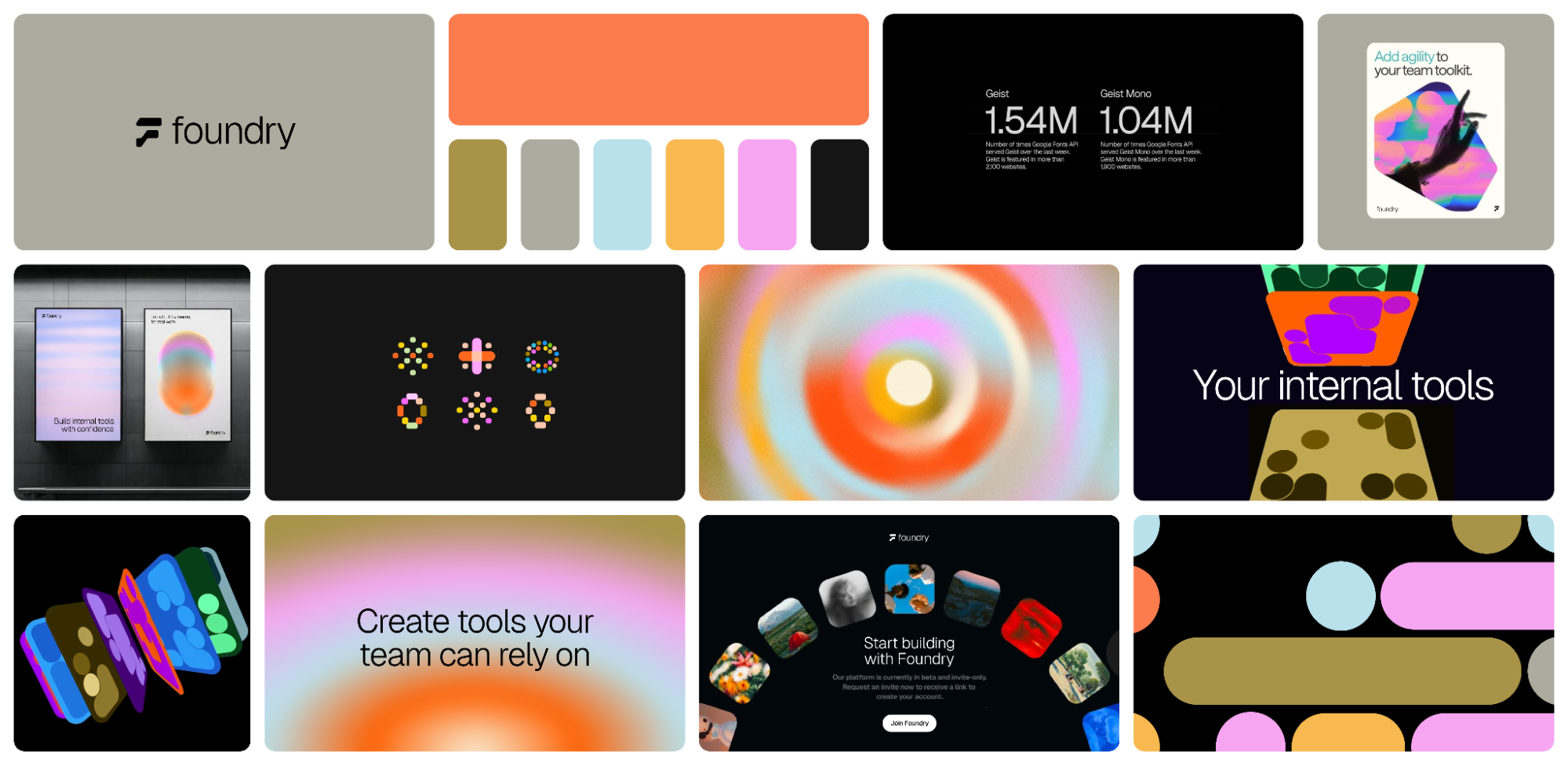
A brand stylescape and foundational visual direction already exists and is attached below. This assignment is about applying and extending that direction thoughtfully, not redefining it.
Visual Character (Guiding Principles)
Foundry’s visual language is intentionally under-defined. We’re less interested in a specific aesthetic and more interested in how visual decisions communicate intelligence and control.
The website should express these qualities through:
- Clear, deliberate layout systems
- Strong hierarchy and spatial rhythm
- Thoughtful use of type, spacing, and alignment
- Visual metaphors rooted in systems, construction, flow, or state
- Motion used to explain relationships, progression, or cause-and-effect
Avoid visual language that feels:
- Cute, playful, or character-driven
- Overly illustrative or decorative
- Trend-led or generic SaaS marketing
Personality should emerge from clarity, precision, and structure, not surface-level style.
Your Task
We’re developing the marketing website homepage for Foundry.
You’re joining the creative team mid-process. Your role is to translate Foundry’s product philosophy into a clear, compelling web experience that explains:
- What Foundry is
- Who it’s for
- Why it’s trustworthy
- How it enables teams to build internal tools without friction
This is not a product UI design task. Avoid designing the app itself. Focus instead on how the website communicates the system, the value, and the mindset behind the product.
In addition to static composition, we’re interested in how layout and interaction decisions can support focus. This includes thoughtful transitions, subtle motion, and unconventional layout ideas, as long as they remain intuitive, legible, and respectful of attention.
What to Design
1. Homepage Information Architecture (Required)
Before jumping into visual design, define the overall structure of the homepage.
Include:
- A section-by-section breakdown of the page
- The purpose of each section
- The intended user journey and reading flow
This can be low-fidelity (wireframe, structured outline, or a flow in a whiteboarding tool). You do not need to visually design every section, we just want to see how you think about hierarchy, sequencing, and narrative across the page.
2. Visual Design (Design only these two sections)
Hero Section
Design a hero that communicates the core idea: teams creating internal tools with confidence.
Consider:
- Composition, hierarchy, and restraint
- How motion, responsiveness, or interaction might reinforce calm focus
- How the hero signals intelligence, structure, and trust
Guidelines:
- Explore layouts that feel distinctive or non-standard while remaining usable and clear
- Think about how users scan, pause, and engage with content
- Balance concept with clarity
Avoid:
- Literal screenshots or full UI mockups
- “AI magic” metaphors
- Purely abstract visuals
We’re looking for something in between: expressive, but grounded in how the product feels. The hero should feel calm, assured, intentional, and intelligent.
Feature Section
Design a feature section that explains how Foundry works at a high level.
Use 3–4 feature blocks. Example themes include:
- Create internal tools without engineering
- Designed for operators, not just builders
- Structured creation, flexible outcomes
- Safe to change, easy to maintain
Guidelines:
- Explore layouts that feel distinctive or non-standard while remaining usable and clear
- Think about how users scan, pause, and engage with content
- Balance concept with clarity
Avoid:
- Playful illustration-led storytelling
- Generic SaaS iconography
- Full-fledged product UI screens
Aim for visuals that feel system-oriented, considered, and professional.
What to Include
Design Files (Required)
Submit a Figma file containing:
- Homepage information architecture (low-fidelity is fine)
- Visual design for:
- Hero section
- Feature section
- Notes or annotations showing clear thinking around:
- Layout structure
- Spacing and hierarchy
- How attention is guided across the page
Optional (encouraged): light prototyping to demonstrate transitions, micro-interactions, or responsive intent.
Process Walkthrough (Required)
Include a Loom recording (5–10 minutes) walking us through:
- Your understanding of the problem
- How you approached IA and layout decisions
- Key visual and interaction choices
- Trade-offs you made and why
We care as much about how you think as what you make.
Tone and References
Foundry should feel:
- Intelligent
- Structured
- Calm, but confident
- Professional and trustworthy
- Modern through clarity, not trendiness
Reference Brands and Websites
These references indicate the level of quality and restraint we’re aiming for. We're not expecting direct copies, and not all of them may align perfectly with the brief. Use your judgment, and feel free to explore other websites of similar caliber to go even further.
- https://www.weavy.ai/
- https://www.waabi.ai/
- https://new.computer/dot
- https://arc.net/
- https://deta.surf/
- https://mymind.com/
- https://www.hidaisy.ai/
- https://visualelectric.com/
- https://wonder.so/
How We’ll Review Your Work
We’re less interested in polish than in process. We’ll be paying attention to:
- How clearly the website communicates the product’s purpose
- How well the website aligns with or enhances the brand
- The clarity, intelligence, and restraint of your visual decisions
- Your ability to design for seriousness without becoming dull
- How IA, layout, and hierarchy support understanding
- How interaction or motion supports focus rather than overwhelm
- Your reasoning: not just what you made, but why you made it
If you have any questions before you begin, feel free to reach out. We’re looking forward to seeing how you approach it.